Design a modern website based on an outdated existing brand guide
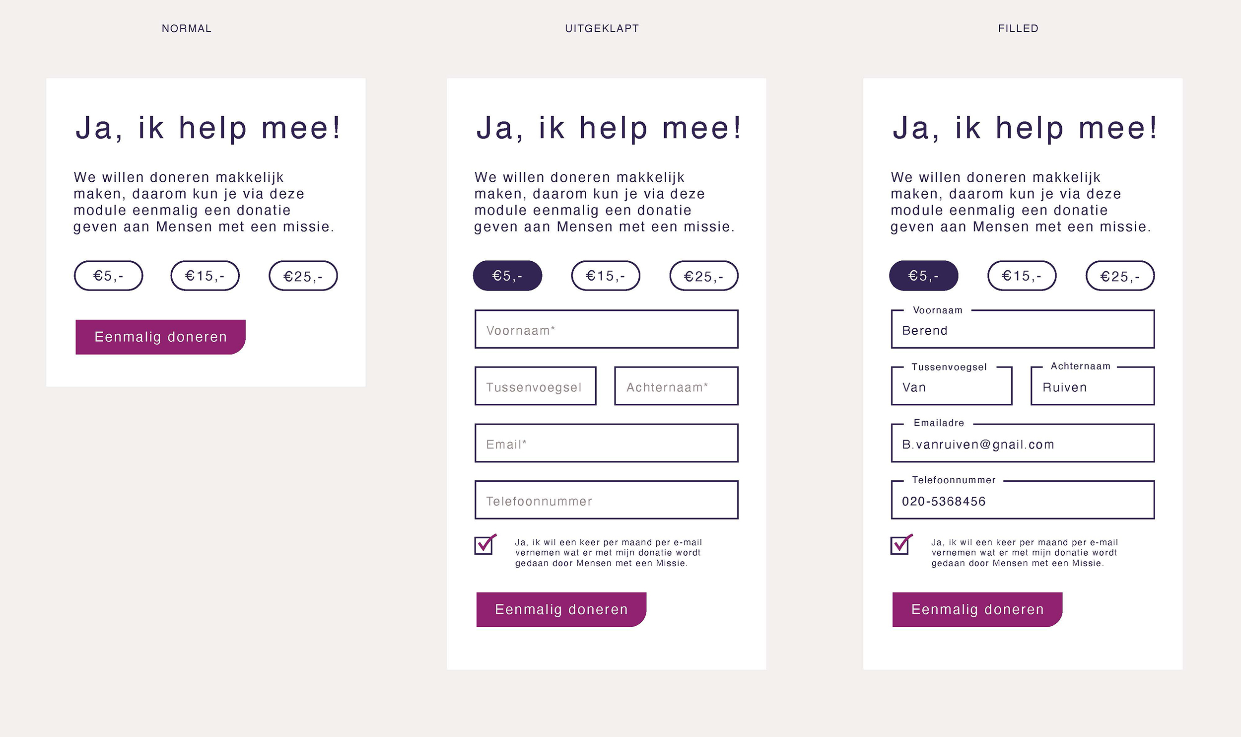
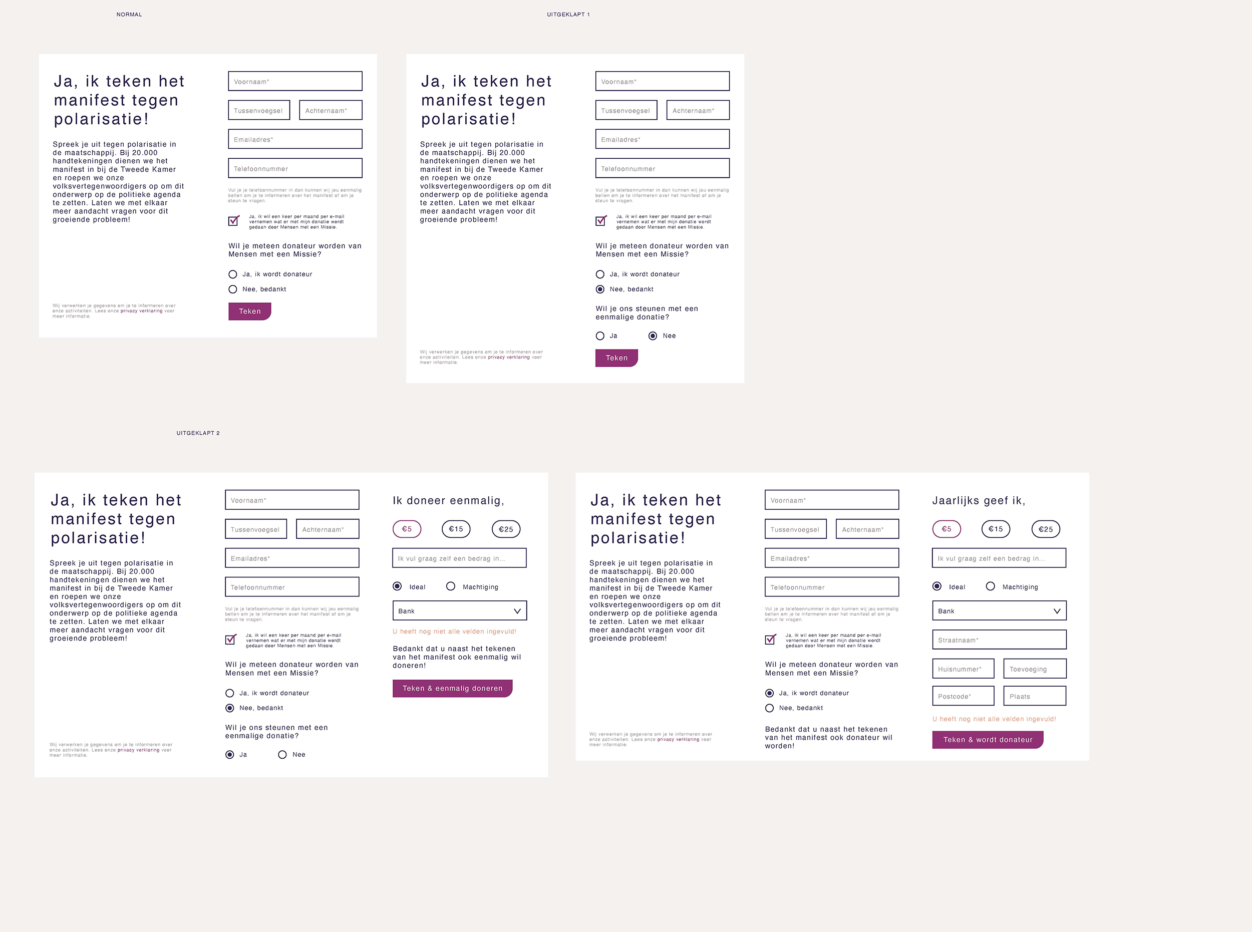
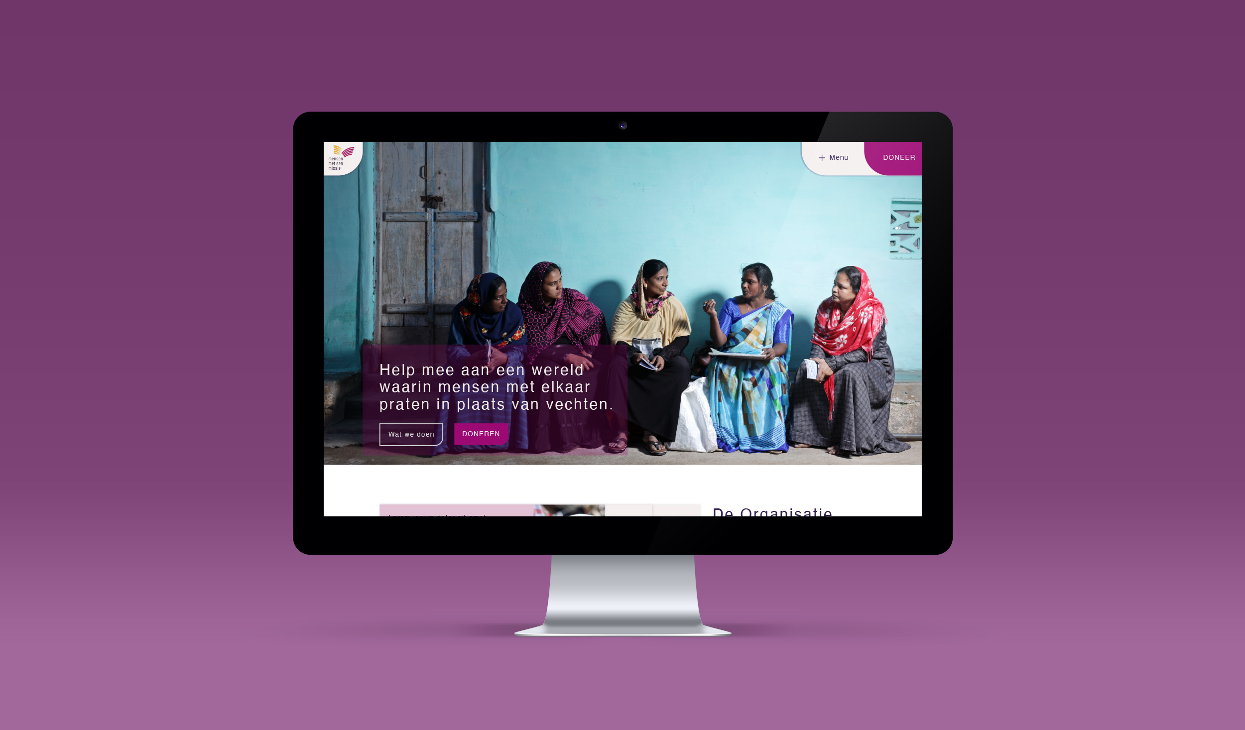
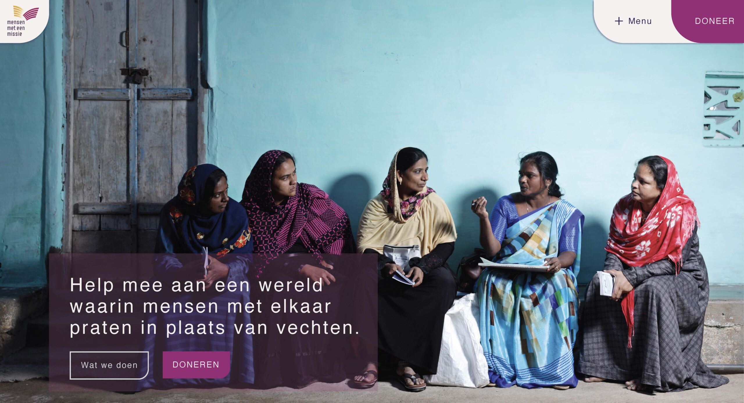
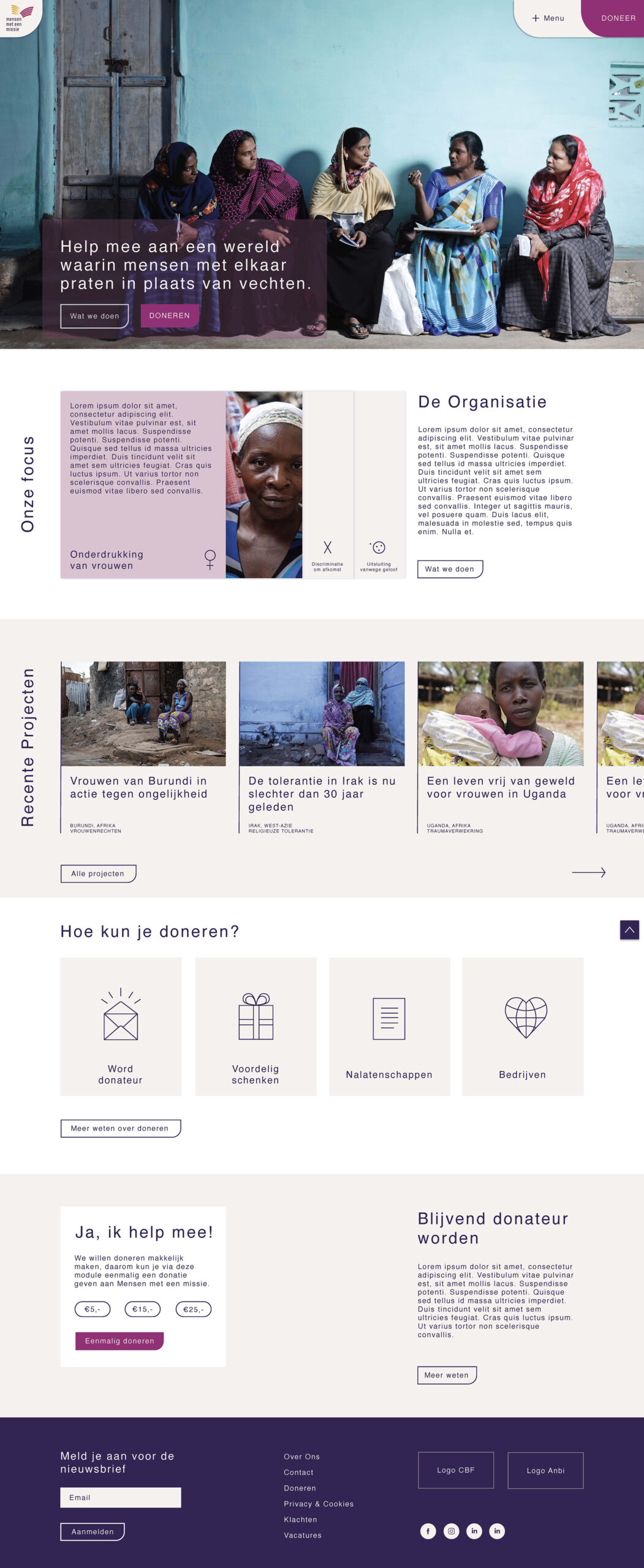
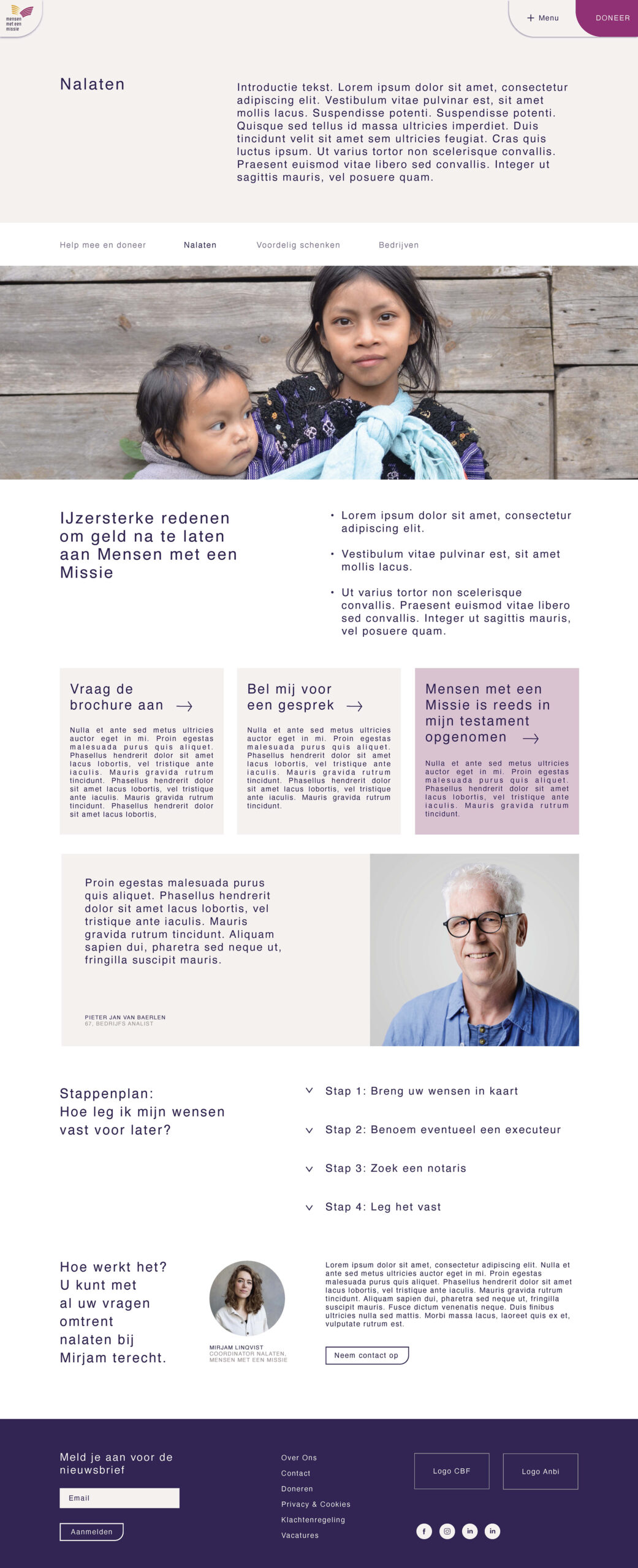
The Dutch humanitarian aid organization ‘Mensen met een Missie’ was ready for a new, user-friendly website. On behalf of Filt, I was hired to create a fresh, but serious design based on their existing brand guide & visual identity. A design that radiates peace and honesty. Where projects are at the heart of the website and where information can be found easily. To extend their visual identity and for online use I created custom icons in line with the new webdesign and for further marketing use. The existing brand guide was quite outdated. Leaving their primary font out of the webdesign and only use the supportive font was a choice that resulted in a more modern look. My advise to the communication team was to spend more time on photo redaction and to hire photographers that made pictures more in line with 2023. This gave them more direction on what kind of pictures to use.
Check the full website of mensenmeteenmissie
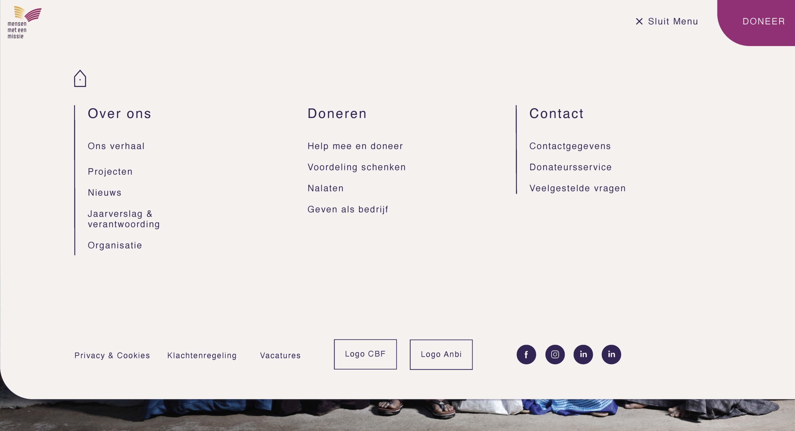
A clear menu is very important, especially for elderly users, the overview of the menu is a major issue. In this big dropdown menu – the user is not overwhelmed with too much choices and because it covers the page almost entirely – it automatically has priority in the brain over any other information.
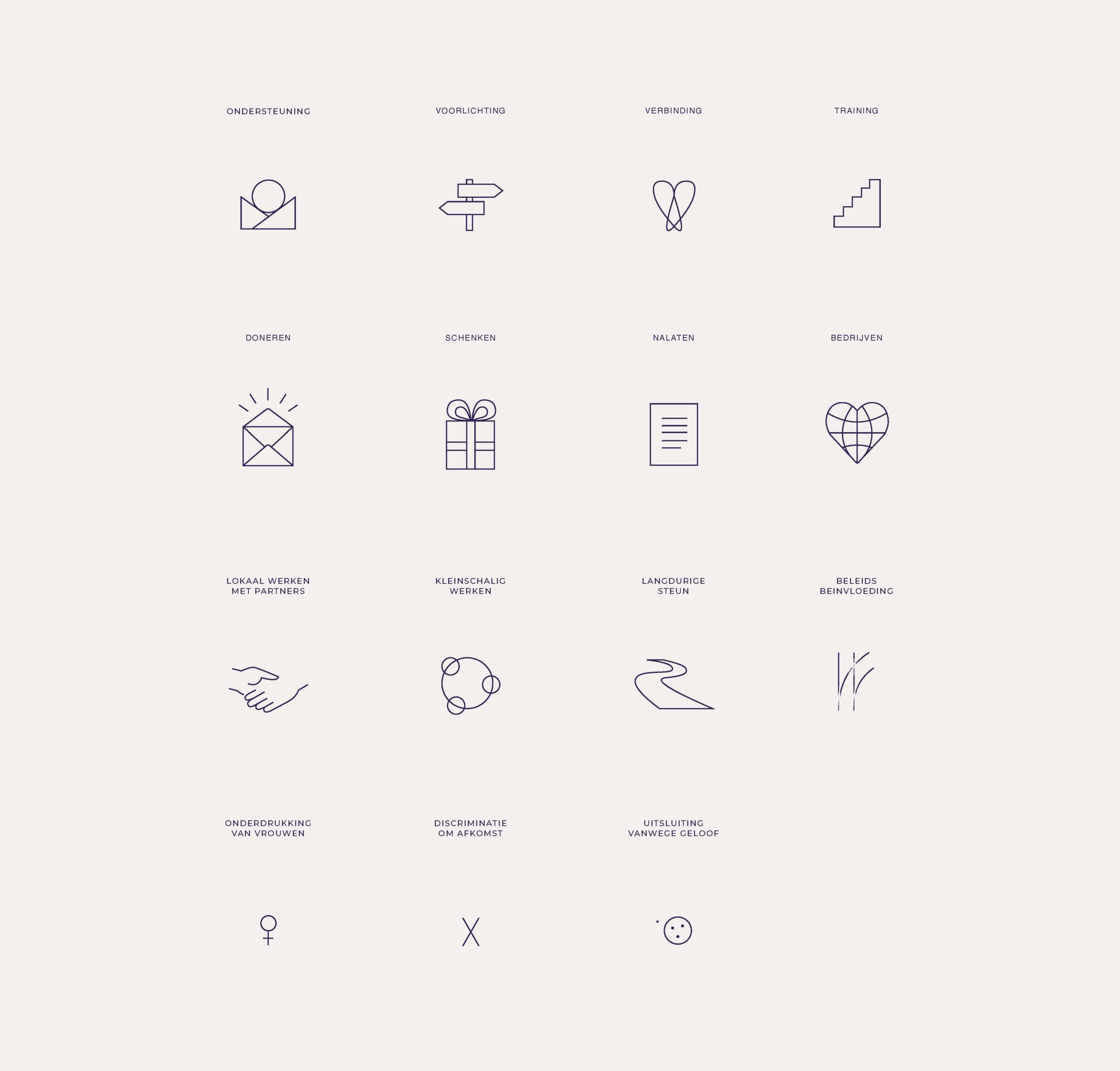
To enhance the identity of Mensen met een Missie I created a style and set of vector icons for them to use. These icons are now used for multiple printed communication items as well.
